The secret behind Stoxcards in 60 seconds
The secret behind Stoxcards is simple: each card takes more than 50 financial metrics and compresses them into a handful of visual stats you can read in seconds, the same way a trading card compresses a whole character down to a few numbers you instantly understand without a manual.
Health, Performance and Risk sit at the center of every card, the same three Core Scores from the Stoxcraft Formula you've already met. Around them sit smaller details: sector, region, market cap, and a TrendMeter arrow showing which way momentum is pointing right now, all without cluttering the main stats. Nothing is hidden here, and nothing requires digging through a menu to find. It's just arranged so your eyes go to what matters first, the same way a good UI always does when it's designed properly.
You've been reading cards like this your whole life already, just not for stocks specifically. Trading cards, player stat lines, RPG character sheets: they all use the same trick of surfacing the important numbers up front and burying the rest. Stoxcards borrow that exact instinct and point it at the market instead of asking you to build a brand-new mental model from scratch.
The design logic behind every Stoxcard
Stoxcards are Stoxcraft's visual format for showing a stock. Every card behind the platform's screener, portfolios and news feed uses the same layout, so once you can read one, you can read all of them.
Why a Stoxcard reads faster than a spreadsheet
Most stock sites still look like they were built decades ago: cluttered tables, endless ratios, a wall of numbers with no obvious starting point. That's not a personal failing if it makes your eyes glaze over. It's a design failure on their end, the same way a badly designed game UI makes new players quit before they've even learned the controls.
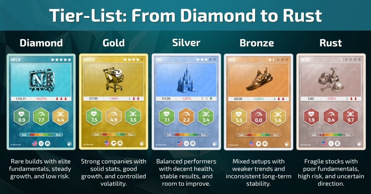
A Stoxcard flips that. Instead of a table, you get something closer to a trading card: a handful of visual stats arranged the same way every time, so your brain doesn't have to relearn the layout on every single stock. Health shows stability. Performance shows track record. Risk shows how bumpy the ride has been. Just like sizing up a build before a match, you can spot a strong card and a risky one at a glance, before you've read a single number, and without needing anyone to walk you through what any of it means first.
What's actually packed into one card
It's worth pausing here for a moment, because this is the part most people assume is the whole story, and it really isn't even close to the full picture.
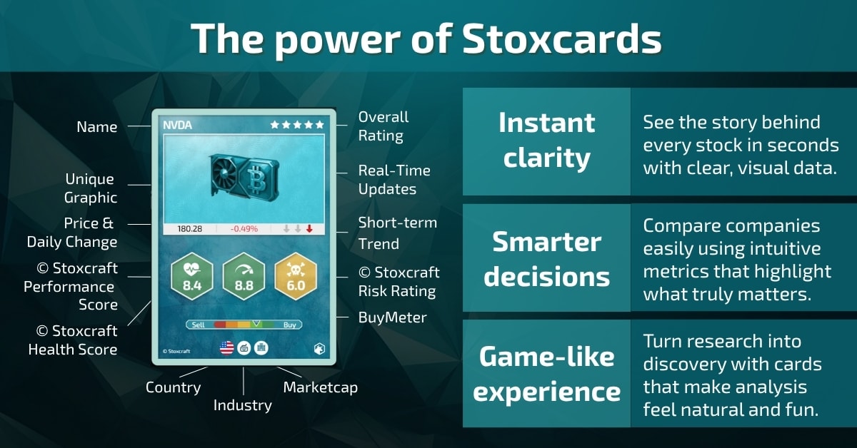
A card isn't just a cool graphic sitting on top of nothing, even though it's easy to assume that at first glance. Research on the picture superiority effect shows the brain processes and recalls visual information faster than raw text or numbers, which is exactly the shortcut a Stoxcard is built to use. Behind every element sit more than 50 financial metrics, processed and compressed into something your instincts can actually use.
Nothing here is arbitrary either. Every element on the card earns its spot through testing, not just because it looked good in a mockup. If a stat doesn't help you decide faster, it doesn't make the cut.
Health, Performance and Risk act as the core stats, the same role strength, defense or agility plays on a character sheet in an RPG, and the full breakdown of how each one gets built lives in the Stoxcraft Formula. The underlying depth doesn't get thrown away in the process. It just doesn't force itself on you before you're actually ready for it.
The smaller elements around those three core stats go through the same consistent filter. Sector tells you what kind of business you're even looking at, and it's usually the first thing your brain uses to set expectations before it reads anything else on the card. Region adds geographic context that changes how you'd read a company's risk exposure. Neither one is filler. Both earned their spot the same way the three core scores did.
Sector, region, market cap, and an Overall Rating in stars pull everything together at the edges of the card. Nothing on it is decorative. Every element ties back to something real underneath it.
And if you want the raw numbers instead, they're never more than a tap away. Every portfolio on Stoxcraft can switch between card view and table view on demand. The card is the default because it's faster to scan, not because the underlying data got hidden from you.
That distinction matters more than it sounds. A platform that only offered cards and buried the raw numbers somewhere you couldn't reach would be hiding complexity, not managing it. Stoxcraft keeps the door open in both directions on purpose.
Three real cards, three completely different builds
Pull up Netflix, Tesla and Coinbase side by side and the differences jump out immediately. Netflix reads steady: strong Health, consistent Performance, controlled Risk. It's not the card that delivers explosive gains, it's the one built for the long game.
Tesla plays differently. Performance runs hot, but the fundamentals don't always keep pace with it, a high-voltage card that trades stability for upside, the kind of pick that rewards conviction and punishes hesitation in equal measure. And Coinbase is the wildcard of the three: solid enough Health, but Risk climbs fast, moving with crypto's own chaos, turning every rally or crash into a sharper swing than the other two ever show.
Same three Core Scores on every card. Three completely different stories, readable in the time it takes to glance at each one, and none of them required you to open a single earnings report to get the gist.
How to spot a shift before you read the news
TrendMeter arrows show you which way a stock's momentum is currently pointing, up or down, without you needing to open a chart. BuyMeter adds the sentiment layer on top: how the crowd is currently leaning on that same stock. Color shifts and score changes on a card often show up before you'd ever stumble onto the headline explaining why.
Checking a portfolio full of Stoxcards ends up feeling less like homework and more like checking a team roster before a match. You're not reading, you're scanning, and you already know exactly what you're scanning for.
Color does a lot of that work quietly. A card trending the wrong way doesn't just say so in text, it shifts color, the same instinct that makes a red status bar register faster than a paragraph explaining a character is low on health. You clock the shift before you've consciously read a single word on the card.
This doesn't replace actually understanding why a stock moved. It just buys you the two or three seconds you'd otherwise spend squinting at a table, and hands them back so you can spend them on something that actually matters.
Why Stoxcards look like this on purpose
This isn't about making finance cute for its own sake. It's a deliberate design choice: take an instinct you've already built up somewhere else and point it at the market instead of asking you to build a brand-new one from a spreadsheet. Research on choice overload and decision paralysis backs up why that matters: too many raw numbers thrown at you at once doesn't make a decision easier, it makes people freeze or walk away entirely. The card format doesn't hide complexity. It just refuses to make you wade through all of it before you get the headline.
That's really the whole trade the card format is making on your behalf: complexity doesn't vanish, it just waits patiently until you actually want to see it instead of showing up uninvited the moment you open a stock for the first time. The rest of the Stoxcraft Academy is where it's laid out skill by skill.
Read your first Stoxcard like a pro
Ready to actually read a card instead of just glancing at it for a few seconds, on a stock you already recognize? Pull up any stock on the Stoxcraft Screener and use this order, it works the same way no matter which sector you start in, and you'll have it memorized faster than you'd expect.
1. Scan Health, Performance and Risk first. Read them the way you'd size up a build before a match: which stat carries the card, and which one might be the weak point that trips it up later on. That order matters more than which number you check last.
2. Check the TrendMeter arrow. It tells you which way things are moving right now, before you go digging around for the headline that explains why the move happened in the first place. Momentum data is often the first sign, not the last.
3. Compare two cards side by side. Pull up a second stock and see how differently two cards with a similar Health Score can actually play once Performance and Risk enter the picture. The gap between them is usually where the real story lives.
Do this on three or four stocks in a row and the format stops feeling new. It starts feeling like something you already know how to do, the same way a new game's UI stops feeling foreign after the first hour with it.
Ready to see how well this stuck? Test what you just learned.
Skill Check
Test what you just learned
A couple of quick questions to lock in what you covered here, then straight on to the next skill.
1 of 3
questions
What inspired the design concept behind Stoxcards?